FARAH BEAUTY SALON
FARAH BEAUTY SALON
FARAH BEAUTY SALON
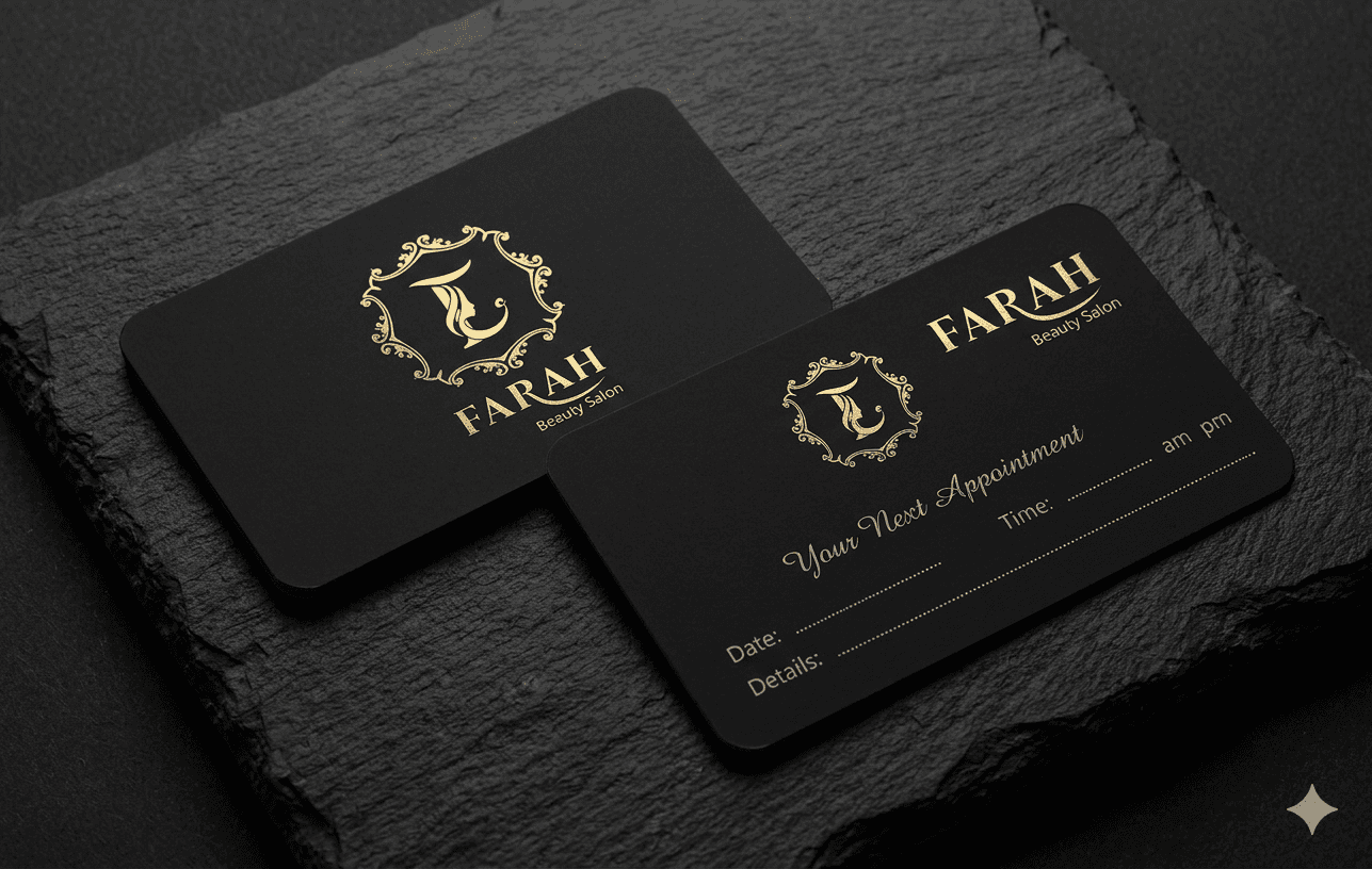
Brand identity, logo, and interior design for a beauty and hair salon, 2020.
Brand identity, logo, and interior design for a beauty and hair salon, 2020.
Brand identity, logo, and interior design for a beauty and hair salon, 2020.
The brief –– An award-winning, family-owned salon for discerning clients, full-service color, cuts, styling, in an "organic glam" setting that pairs crystal chandeliers with natural wood. The identity had to hold that exact tension: polished but not cold, refined but warm.
The brief –– An award-winning, family-owned salon for discerning clients, full-service color, cuts, styling, in an "organic glam" setting that pairs crystal chandeliers with natural wood. The identity had to hold that exact tension: polished but not cold, refined but warm.
The brief –– An award-winning, family-owned salon for discerning clients, full-service color, cuts, styling, in an "organic glam" setting that pairs crystal chandeliers with natural wood. The identity had to hold that exact tension: polished but not cold, refined but warm.
The idea –– A fine-lined gold monogram on black, elegant but not ornate for its own sake. The precision of the linework signals craft; the warmth of the gold keeps it from tipping into sterile luxury, the "organic glam" balance rendered in a mark.
The idea –– A fine-lined gold monogram on black, elegant but not ornate for its own sake. The precision of the linework signals craft; the warmth of the gold keeps it from tipping into sterile luxury, the "organic glam" balance rendered in a mark.
The idea –– A fine-lined gold monogram on black, elegant but not ornate for its own sake. The precision of the linework signals craft; the warmth of the gold keeps it from tipping into sterile luxury, the "organic glam" balance rendered in a mark.
Why this direction –– The mark earns "luxury" by being precise rather than by saying so, and holds the warmth that separates Farah from a cold high-end template, matching the room a client actually walks into.
Why this direction –– The mark earns "luxury" by being precise rather than by saying so, and holds the warmth that separates Farah from a cold high-end template, matching the room a client actually walks into.
Why this direction –– The mark earns "luxury" by being precise rather than by saying so, and holds the warmth that separates Farah from a cold high-end template, matching the room a client actually walks into.