Rethinking the LinkedIn Job Application Flow through an Application Tracking System
Rethinking the LinkedIn Job Application Flow through an Application Tracking System
Rethinking the LinkedIn Job Application Flow through an Application Tracking System

For professionals at every experience level, LinkedIn is the primary engine for career growth. However, the current journey is often hindered by friction. This project focuses on two critical user needs: bringing transparency to the job application process and simplifying how users find the right connections.
For professionals at every experience level, LinkedIn is the primary engine for career growth. However, the current journey is often hindered by friction. This project focuses on two critical user needs: bringing transparency to the job application process and simplifying how users find the right connections.
For professionals at every experience level, LinkedIn is the primary engine for career growth. However, the current journey is often hindered by friction. This project focuses on two critical user needs: bringing transparency to the job application process and simplifying how users find the right connections.
My Role
UX / UI Designer
Duration
4 Weeks
Tools
Figma, Fig Jam, Maze, Miro, Trello,
Adobe Illustrator, Photoshop,
Figma Make, Lovable, Claude, Gemeni, Chat GPT
My Role
UX / UI Designer
Duration
4 Weeks
Tools
Figma, Fig Jam, Maze, Miro, Trello,
Adobe Illustrator, Photoshop,
Figma Make, Lovable, Claude, Gemeni, Chat GPT
My Role
UX / UI Designer
Duration
4 Weeks
Tools
Figma, Maze, Meet, Adobe Illustrator, Figma Make, Lovable, AI Brush, Photoshop,
Story Board
Story Board
Job hunting on LinkedIn is not a smooth experience
Job hunting on LinkedIn is not a smooth experience
Job hunting on LinkedIn is not a smooth experience
Understanding users’ core needs
Understanding users’ core needs
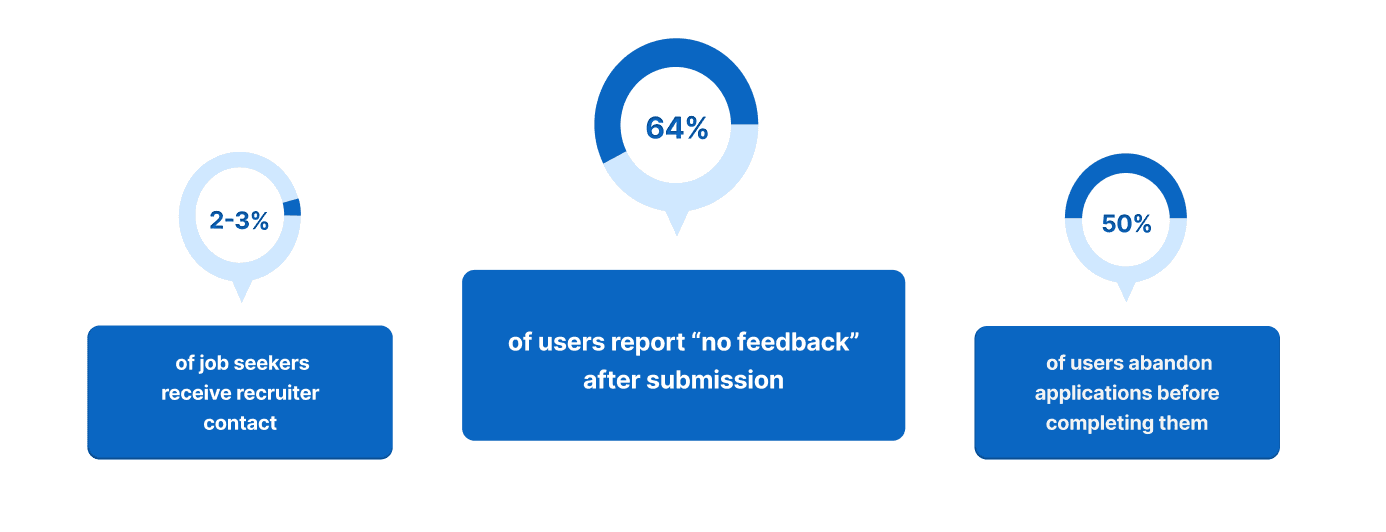
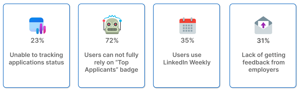
64% of Applicants through LinkedIn Receive No Feedback
64% of Applicants through LinkedIn Receive No Feedback
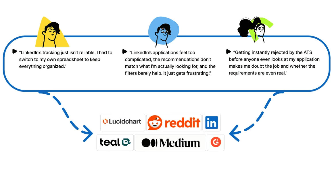
To understand the frustrations users experience with LinkedIn, we began by analyzing comments from the Job seekers community forums, Reddit, Indeed, Lucid Chart, Teal, Medium, and other platforms.
To understand the frustrations users experience with LinkedIn, we began by analyzing comments from the Job seekers community forums, Reddit, Indeed, Lucid Chart, Teal, Medium, and other platforms.
To understand the frustrations users experience with LinkedIn, we began by analyzing comments from the Job seekers community forums, Reddit, Indeed, Lucid Chart, Teal, Medium, and other platforms.
Desk Research insight
Desk Research insight
Complex Application Flow progress and Poor Job Matching
Complex Application Flow progress and Poor Job Matching
What is the core problem?
What is the core problem?
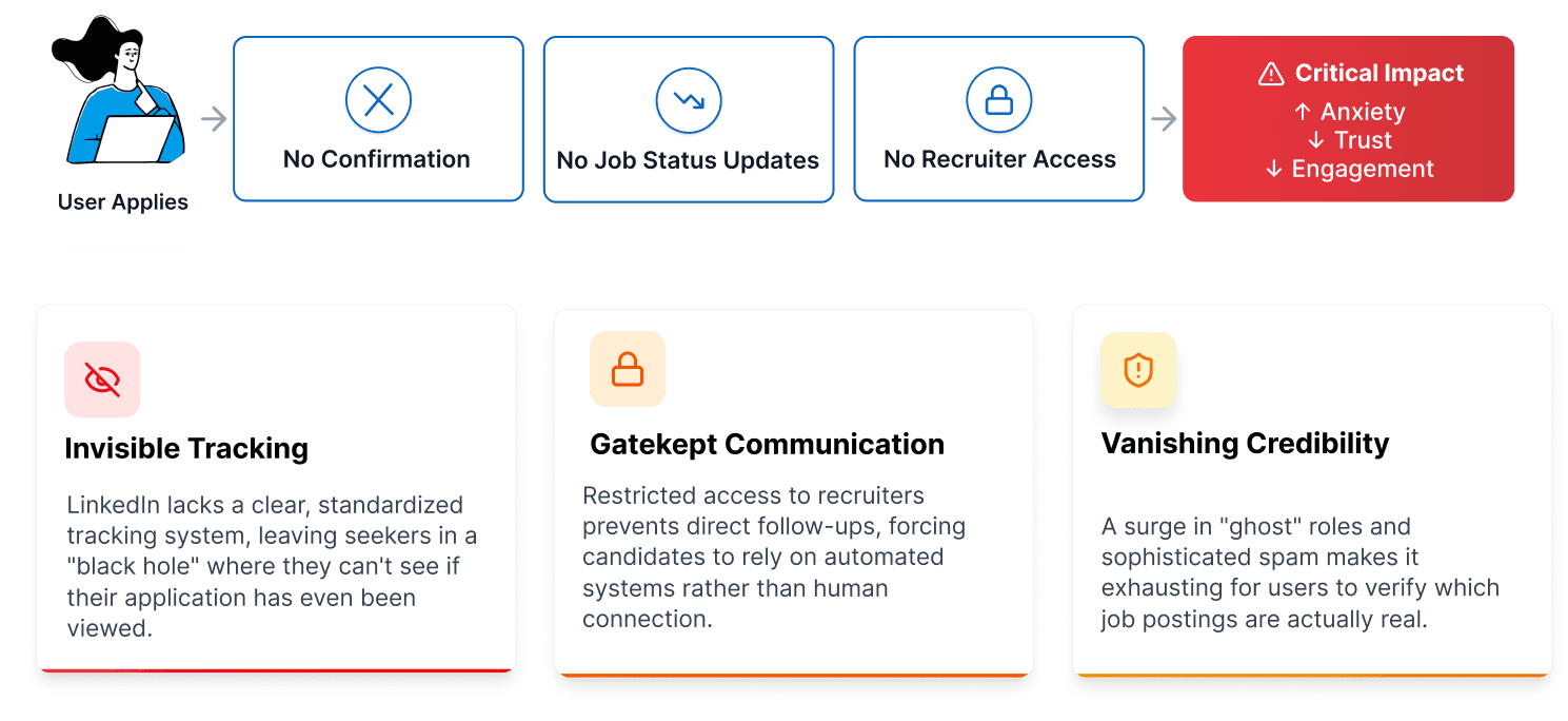
The three major issues
The three major issues
HMW
HMW
How might we redesign the job search experience to prioritize clarity, verification, and feedback, moving candidates from uncertainty to confidence?
How might we redesign the job search experience to prioritize clarity, verification, and feedback, moving candidates from uncertainty to confidence?
How might we redesign the job search experience to prioritize clarity, verification, and feedback, moving candidates from uncertainty to confidence?
Our Solution
Our Solution
How might we redesign the job search experience to prioritize clarity, verification, and feedback, moving candidates from uncertainty to confidence?
How might we redesign the job search experience to prioritize clarity, verification, and feedback, moving candidates from uncertainty to confidence?
How might we redesign the job search experience to prioritize clarity, verification, and feedback, moving candidates from uncertainty to confidence?

the Process
the Process
Interview and Survey Highlights
Interview and Survey Highlights
72% User Don’t Trust the “Top Applicants” Badge
72% User Don’t Trust the “Top Applicants” Badge
72% User Don’t Trust the “Top Applicants” Badge
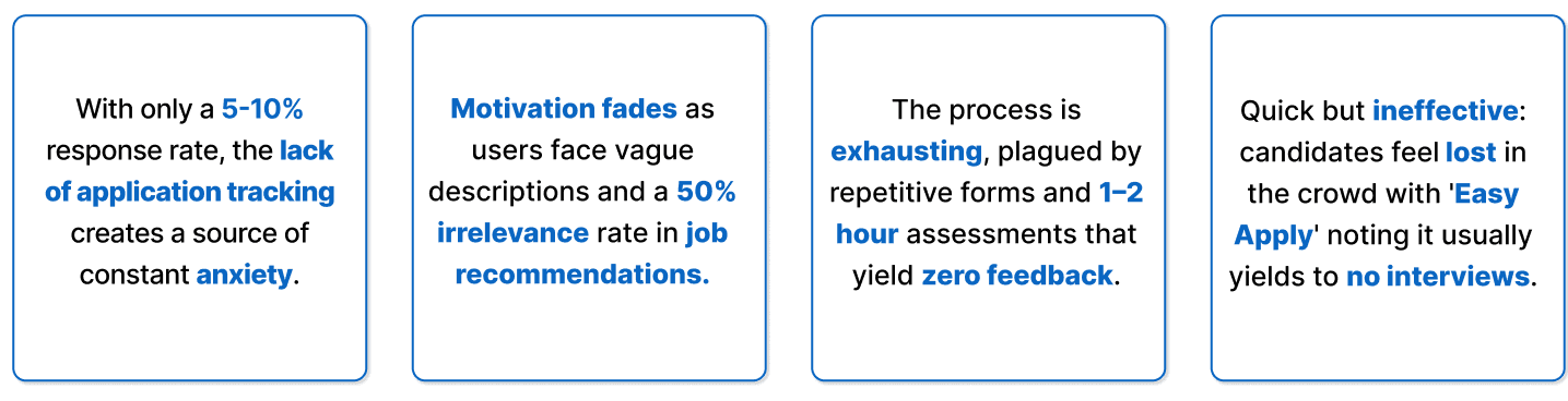
Insights from 8 interviews and 140 surveys reveal exhaustion driven by unresponsive recruiters, tedious applications, vague descriptions, unclear tracking, and distrust of 'Easy Apply'.
Insights from 8 interviews and 140 surveys reveal exhaustion driven by unresponsive recruiters, tedious applications, vague descriptions, unclear tracking, and distrust of 'Easy Apply'.
Insights from 8 interviews and 140 surveys reveal exhaustion driven by unresponsive recruiters, tedious applications, vague descriptions, unclear tracking, and distrust of 'Easy Apply'.
Survey Results
Survey Results
Interview Results
Interview Results
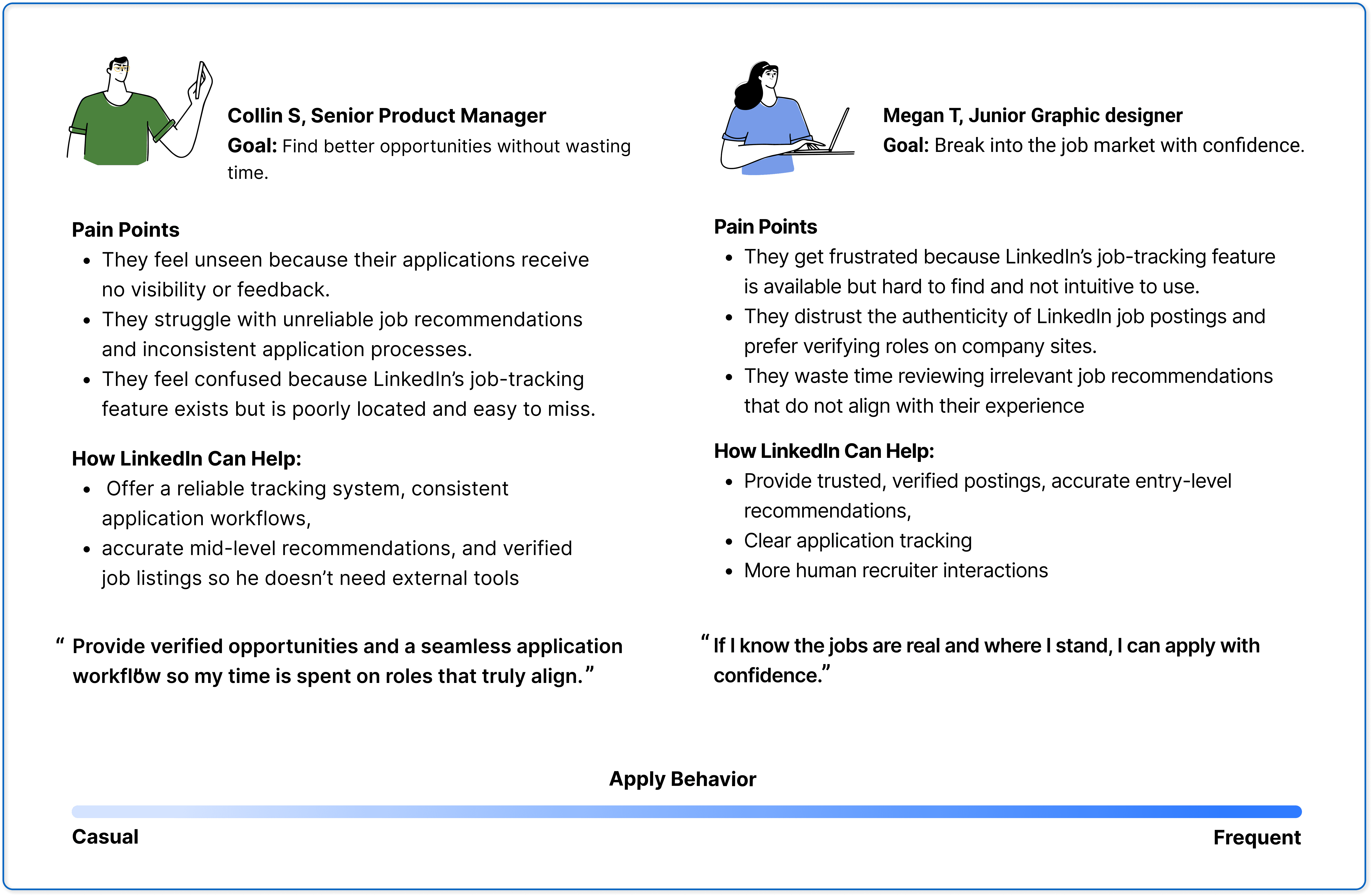
Who Are We Designing For?
Who Are We Designing For?
From Career Signaling to Career Building: LinkedIn Usage Personas
From Career Signaling to Career Building: LinkedIn Usage Personas
From Career Signaling to Career Building: LinkedIn Usage Personas
We identified two core LinkedIn personas, Senior Managers and Junior Designers, who use the platform for distinct professional goals. Understanding these differences exposed gaps in career support and informed our design direction.
We identified two core LinkedIn personas, Senior Managers and Junior Designers, who use the platform for distinct professional goals. Understanding these differences exposed gaps in career support and informed our design direction.
We identified two core LinkedIn personas, Senior Managers and Junior Designers, who use the platform for distinct professional goals. Understanding these differences exposed gaps in career support and informed our design direction.
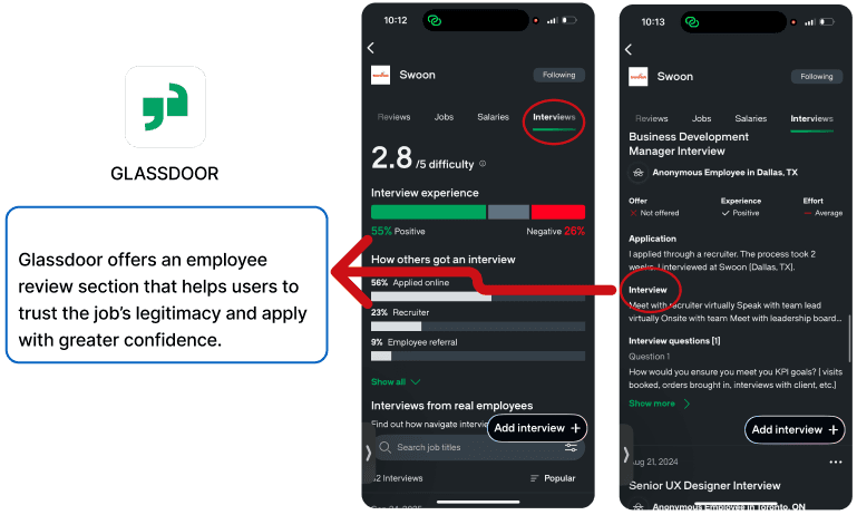
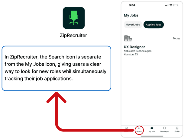
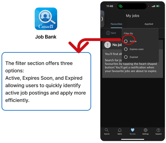
Competitive Analysis
Competitive Analysis
How Do Competitor platforms Support Career Growth?
How Do Competitor platforms Support Career Growth?
How Do Competitor platforms Support Career Growth?
We analyzed LinkedIn alongside competing professional and networking platforms to understand how they help users showcase experience, build credibility, and discover opportunities. This comparison revealed differences in how effectively each platform supports visibility, communication, and meaningful career progression.
We analyzed LinkedIn alongside competing professional and networking platforms to understand how they help users showcase experience, build credibility, and discover opportunities. This comparison revealed differences in how effectively each platform supports visibility, communication, and meaningful career progression.
We analyzed LinkedIn alongside competing professional and networking platforms to understand how they help users showcase experience, build credibility, and discover opportunities. This comparison revealed differences in how effectively each platform supports visibility, communication, and meaningful career progression.


Identifying user journeys
Identifying user journeys
What users experience
What users experience
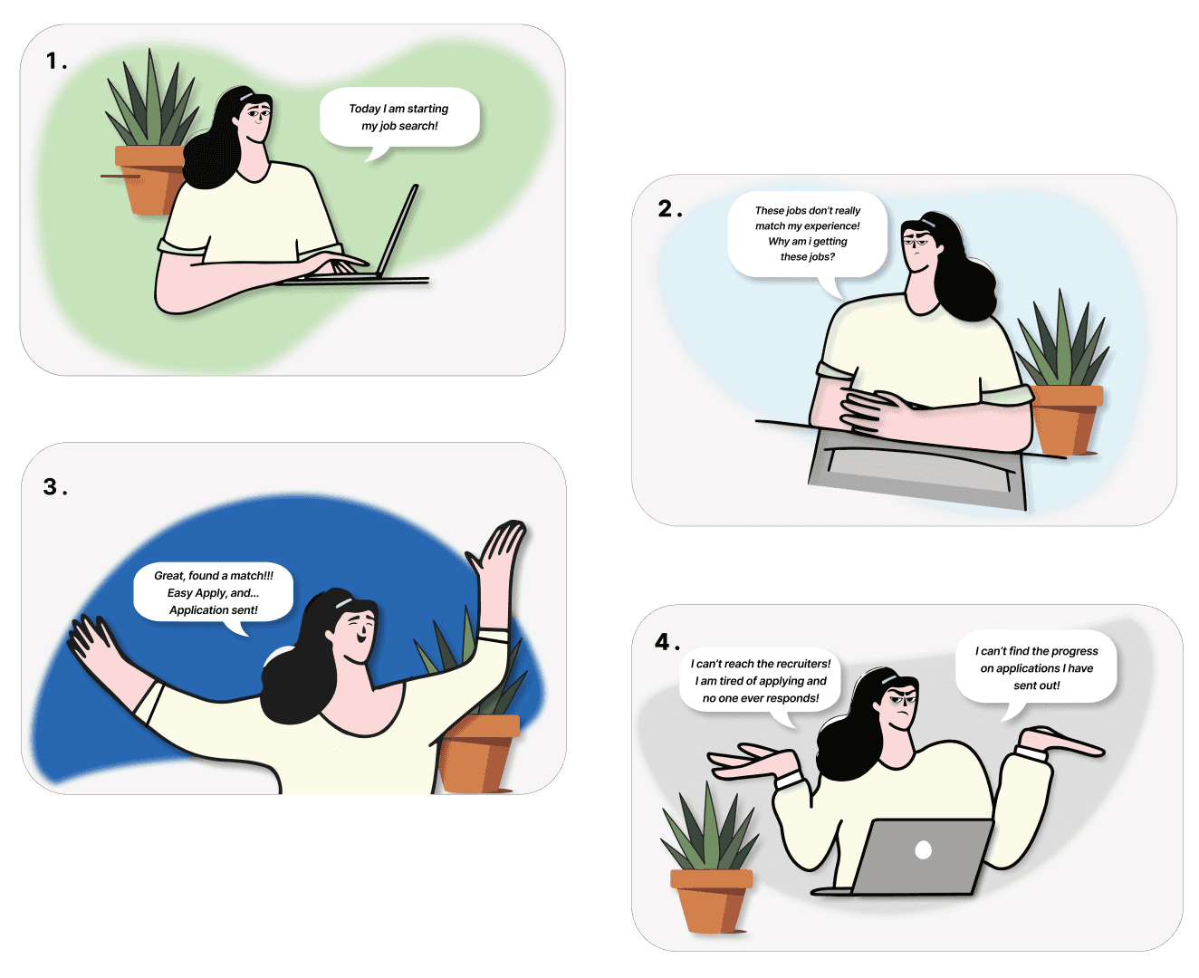
We identified two key applicant journeys:
Mid-level applicants rely on networks but lose trust due to limited tracking, recruiter access,
and feedback, often ending in burnout.
Entry-level applicants face early uncertainty around job credibility and application status,
leading to confusion and discouragement.
Both journeys point to the same problem: a lack of transparency and feedback undermines trust for all users.
We identified two key applicant journeys:
Mid-level applicants rely on networks but
lose trust due to limited tracking, recruiter
access, and feedback, often ending in
burnout.
Entry-level applicants face early uncertainty
around job credibility and application status,
leading to confusion and discouragement.
Both journeys point to the same problem: a lack of transparency and feedback undermines trust for all users.
We identified two key applicant journeys:
Mid-level applicants rely on networks but lose trust due to
limited tracking, recruiter access, and feedback, often
ending in burnout.
Entry-level applicants face early uncertainty around job
credibility and application status, leading to confusion and
discouragement.
Both journeys point to the same problem: a lack of transparency and feedback undermines trust for all users.


Impact Matrix
Impact Matrix
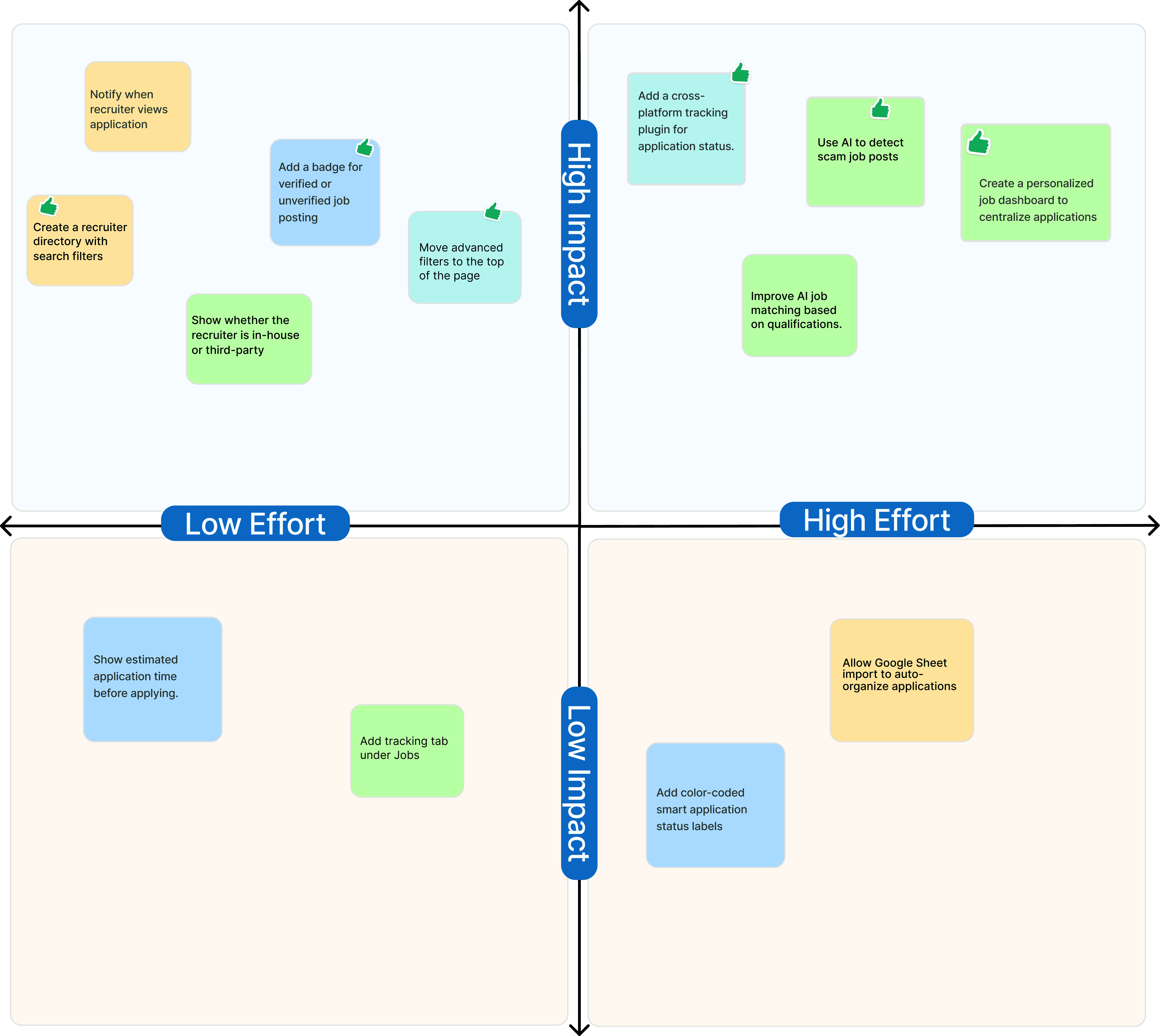
Feature Prioritization: Impact vs. Effort Matrix
Feature Prioritization: Impact vs. Effort Matrix
Feature Prioritization: Impact vs. Effort Matrix
By combining insights from user interviews and surveys, we prioritized solutions based on user impact and development effort. Impact was measured by how well features addressed eroding trust, lack of transparency, and the “application uncertain status.” Effort was assessed by technical complexity, from AI-driven scam detection to simpler UI improvements. This approach helped identify quick wins that deliver immediate value without major engineering changes.
By combining insights from user interviews and surveys, we prioritized solutions based on user impact and development effort. Impact was measured by how well features addressed eroding trust, lack of transparency, and the “application black hole.” Effort was assessed by technical complexity, from AI-driven scam detection to simpler UI improvements. This approach helped identify quick wins that deliver immediate value without major engineering changes.
the results
the results
Before and After Results
Before and After Results
Every application, every status, every recruiter all in one place
Every application, every status, every recruiter all in one place
Every application, every status, every recruiter all in one place
The redesign transformed LinkedIn's fragmented job search into a unified, transparent experience. We centralized every interaction into a single Application Tracking System. Users now track each application's status, manage resumes with "Edit" and "Set as Default" controls, and message recruiters directly without a Premium paywall.
A new Application Progress Bar replaces the post-submission uncertainty with a clear visual of where every application stands. The redesigned filter system surfaces search criteria upfront instead of burying them. Together, these changes shift the user journey from "optimistic to burned out" toward "confident to engaged", restoring the trust LinkedIn's current experience is missing.
Before
After

Jobs Tab
Jobs Tab
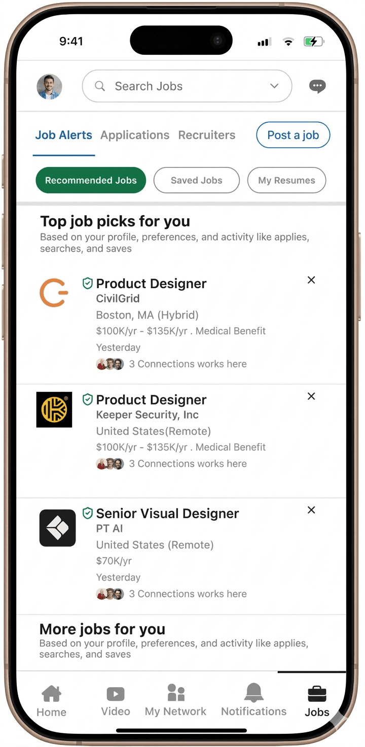
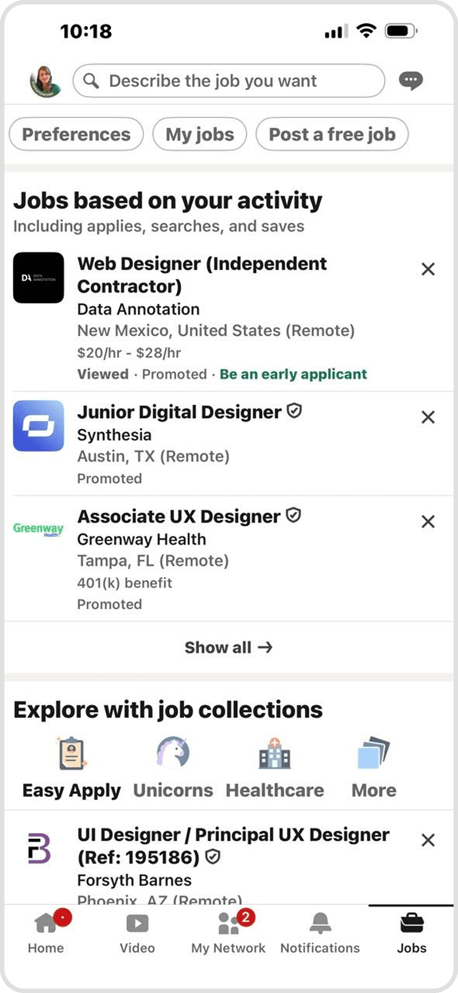
A core pillar of our redesign was the creation of a centralized job dashboard, transforming LinkedIn’s previously fragmented navigation into a unified command center. While the original version lacked structure and clear pathways between features, our redesign reorganizes the header with an improved visual hierarchy and dedicated labels.
By integrating a direct "My Resumes" option and an all-in-one application tracking system, we’ve eliminated the need to hunt through disconnected menus. This cohesive navigation allows users to manage their entire job search, from document control to status tracking efficiently from one single and professional hub.
Before
After
Jobs Tab
Before
A core pillar of our redesign was transforming the scattered LinkedIn experience into a centralized job dashboard. By integrating a dedicated Application Tracking System (ATS) directly into the user interface, we’ve created a single point of truth for the entire job search.
Instead of jumping between disconnected tabs, users can now manage their resumes, track application statuses, and communicate with recruiters from one unified hub.
This all-in-one approach eliminates the uncertainty of job seeking, providing the organization and transparency needed to navigate a modern career search with confidence.
After

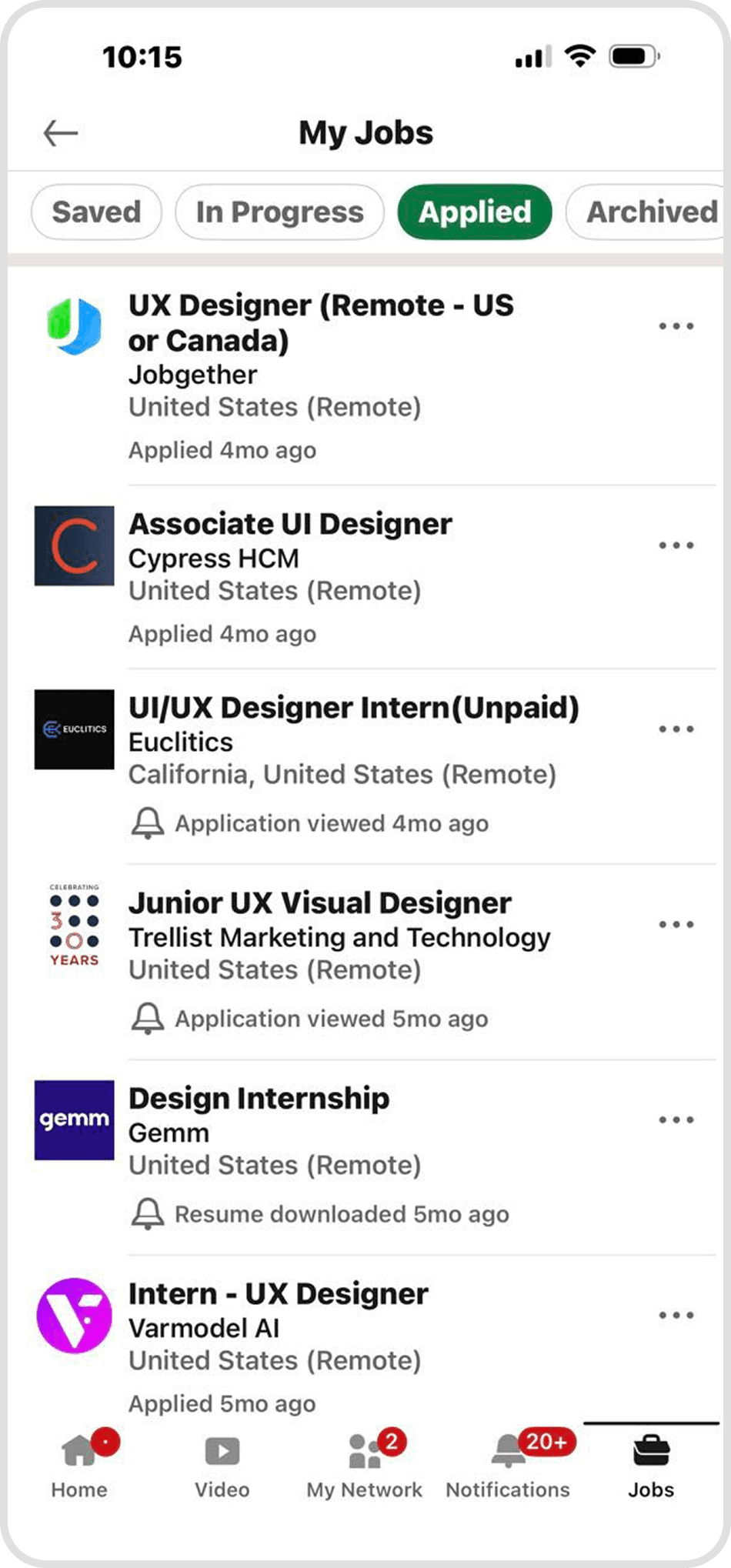
Applied Tab
Applied Tab
Before
After
Applied Tab
A core pillar of our redesign was transforming the scattered LinkedIn experience into a centralized job dashboard. By integrating a dedicated Application Tracking System (ATS) directly into the user interface, we’ve created a single point of truth for the entire job search.
Instead of jumping between disconnected tabs, users can now manage their resumes, track application statuses, and communicate with recruiters from one unified hub.
This all-in-one approach eliminates the uncertainty of job seeking, providing the organization and transparency needed to navigate a modern career search with confidence.
Before
Before
After
After

Resume Tab
Resume Tab
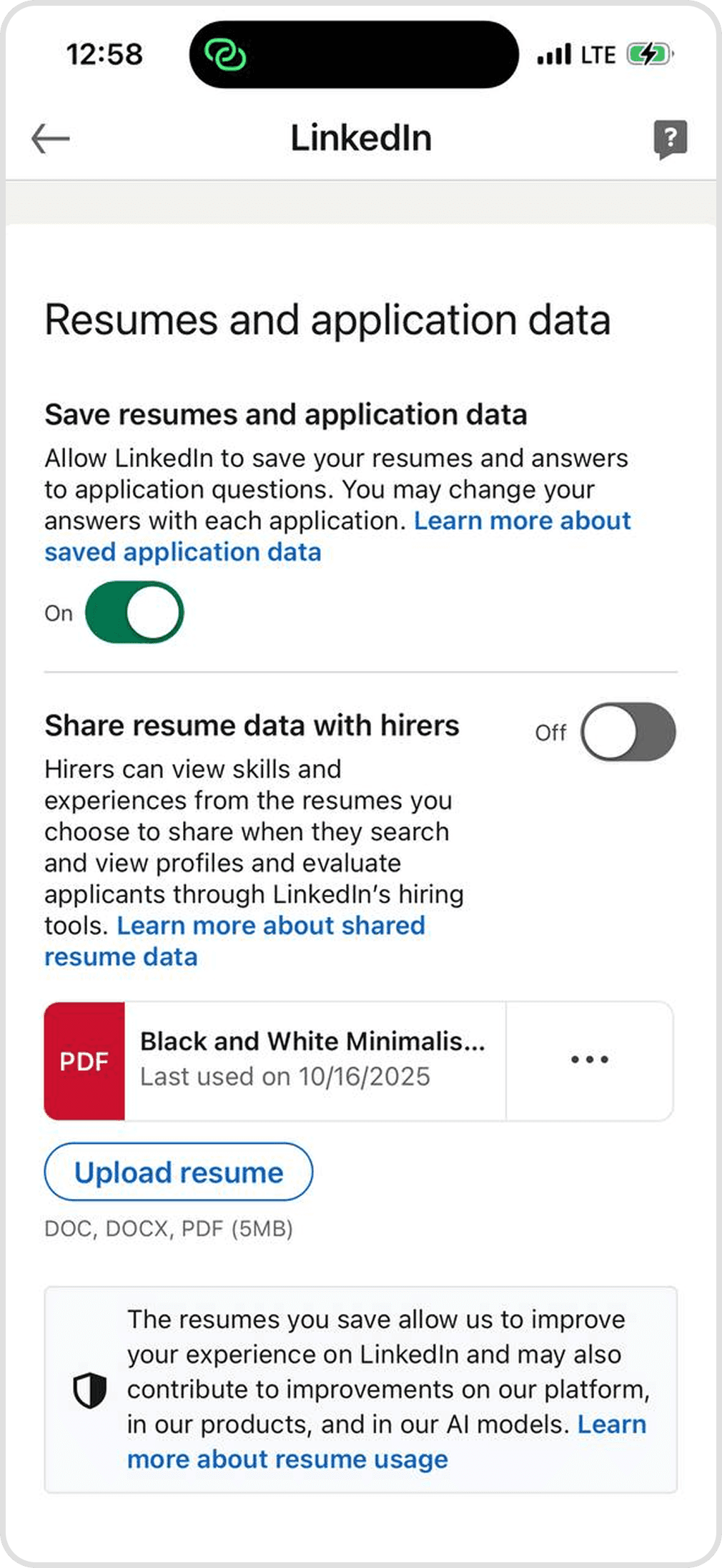
While the original LinkedIn interface only allowed for basic uploads and viewing, our redesign introduces "Edit" and "Set as Default" functions directly within the platform. These tools allow users to refine their details on the fly and designate a primary resume for instant applications. By replacing a rigid system with a high-efficiency management hub, we’ve given job seekers significantly more flexibility and control over their professional first impression.
While the original LinkedIn interface only allowed for basic uploads and viewing, our redesign introduces "Edit" and "Set as Default" functions directly within the platform. These tools allow users to refine their details on the fly and designate a primary resume for instant applications. By replacing a rigid system with a high-efficiency management hub, we’ve given job seekers significantly more flexibility and control over their professional first impression.
Before
After
Resume Tab
While the original LinkedIn interface only allowed for basic uploads and viewing, our redesign introduces "Edit" and "Set as Default" functions directly within the platform. These tools allow users to refine their details on the fly and designate a primary resume for instant applications. By replacing a rigid system with a high-efficiency management hub, we’ve given job seekers significantly more flexibility and control over their professional first impression.
Before
Before

After
After


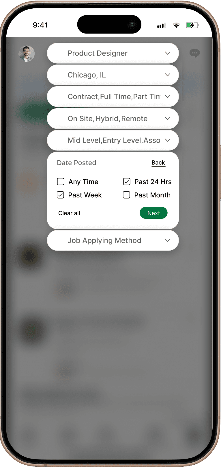

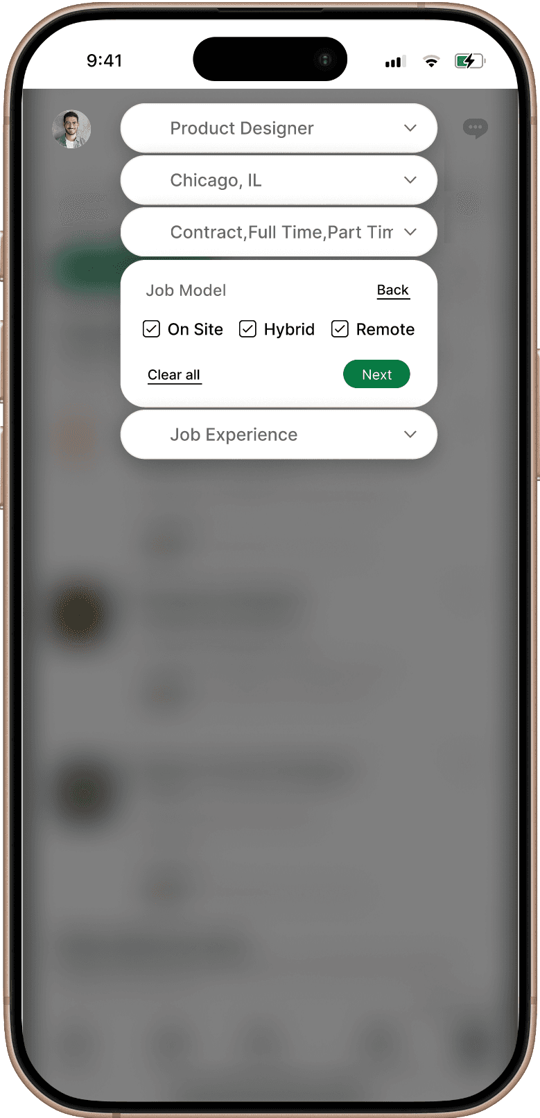
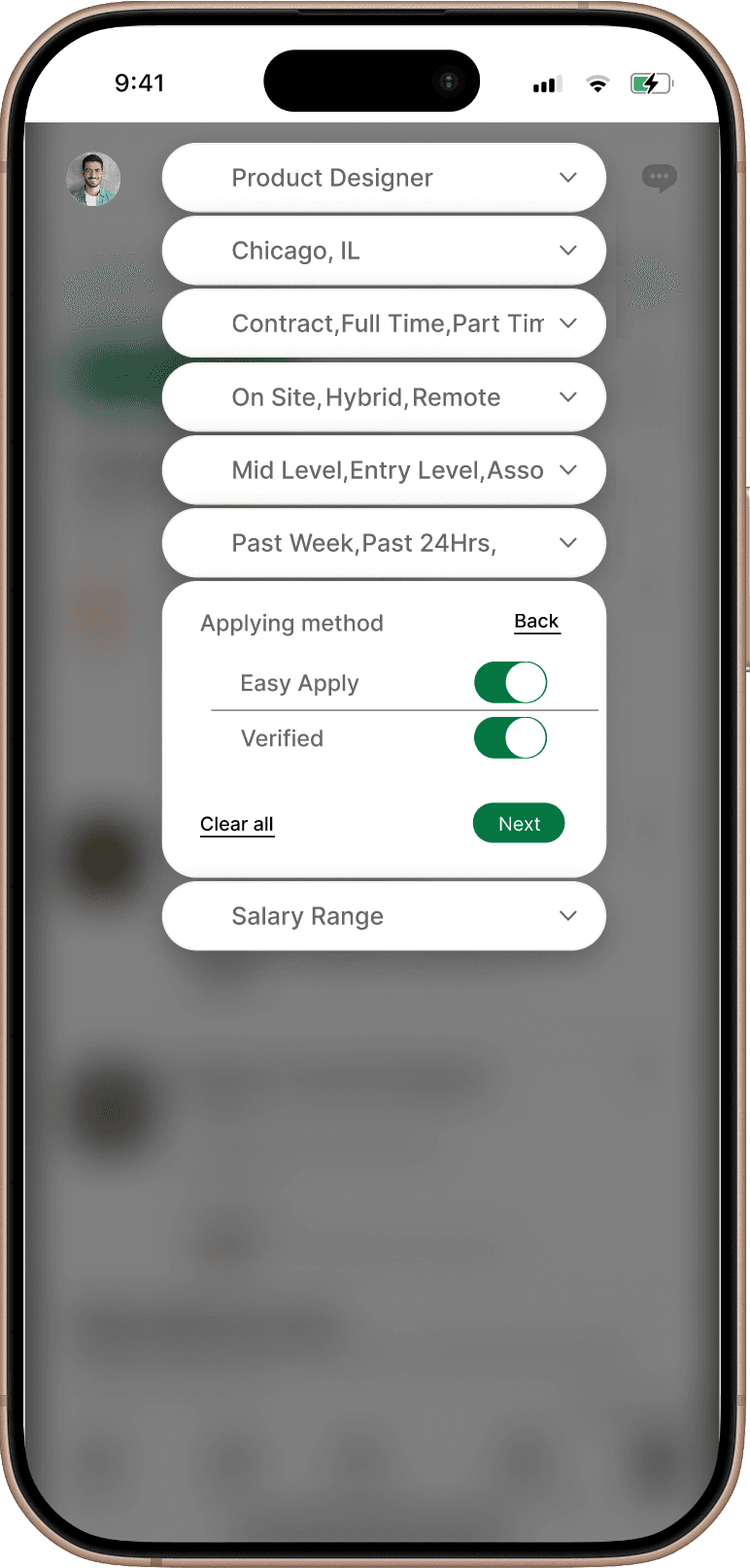
Filters added to Search box
Filters added to Search box
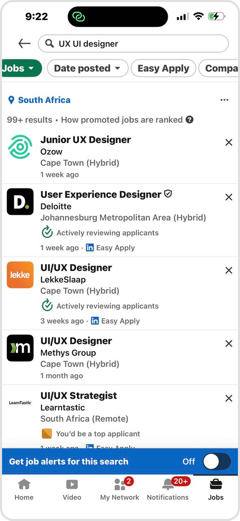
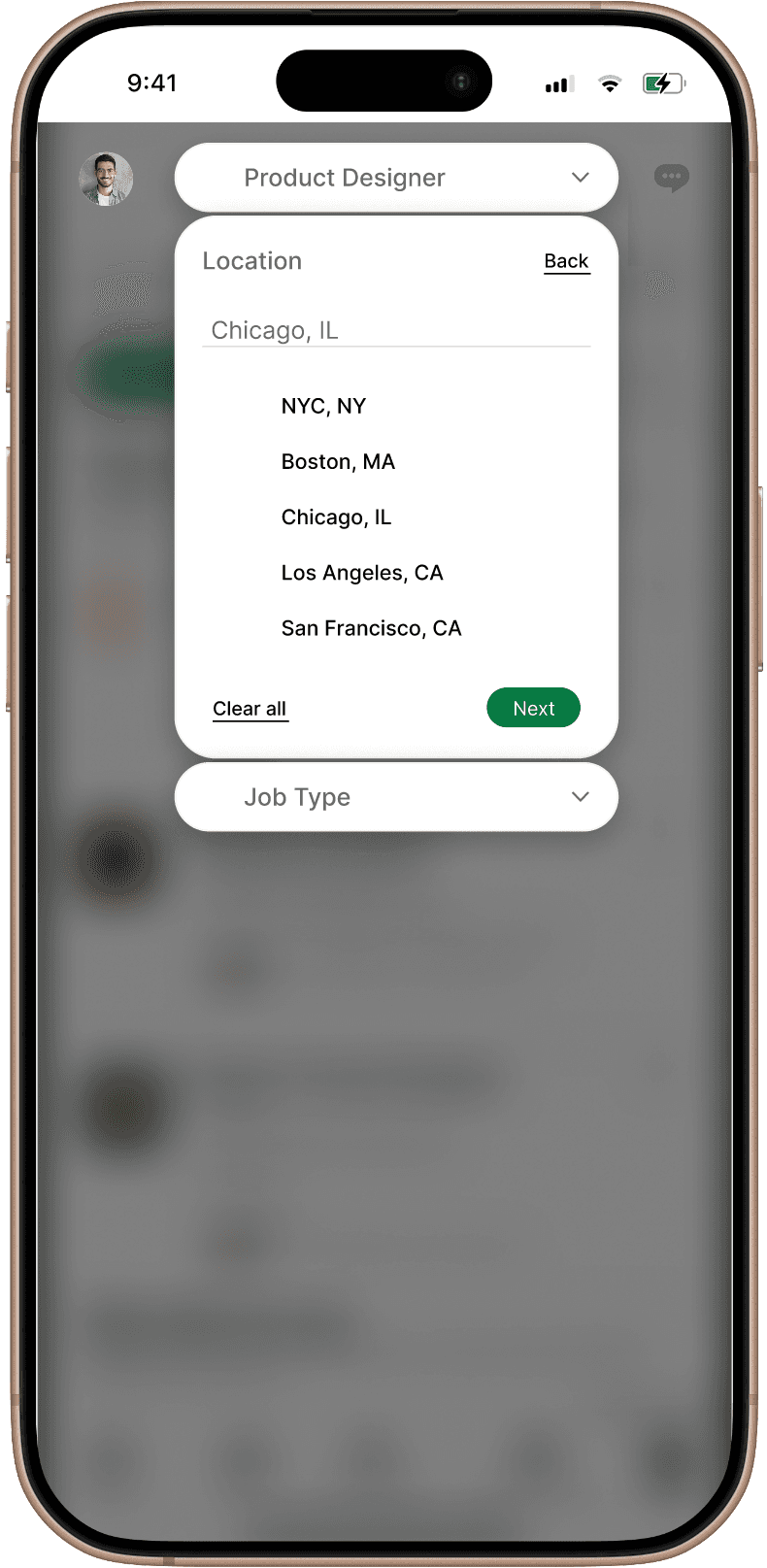
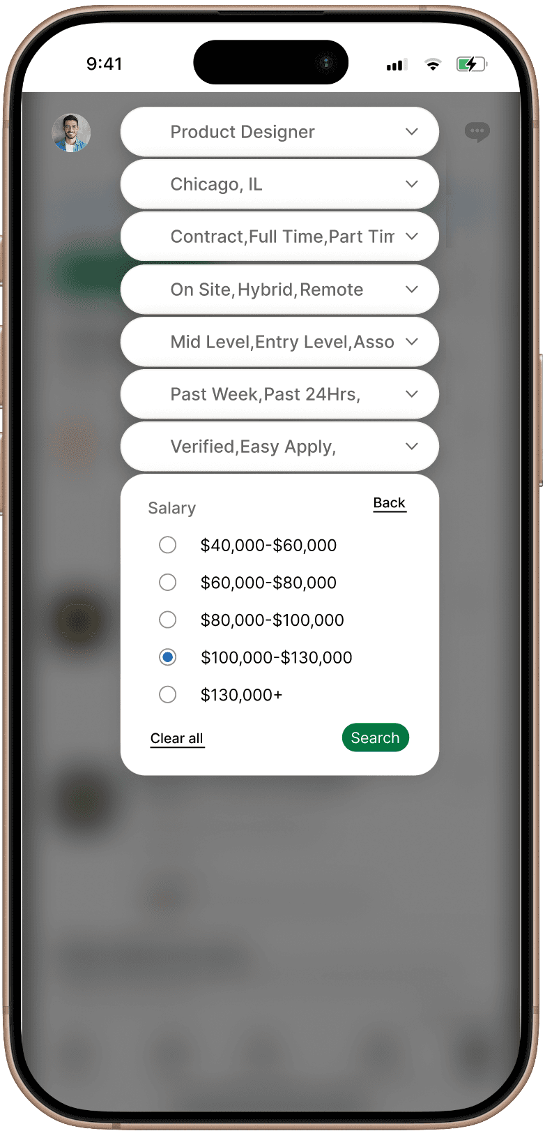
In the redesigned version we are suggesting in LinkedIn, the search bar is transformed into an intuitive filtering hub. Upon clicking the search box, a dynamic dropdown menu appears, offering a variety of preset categories to help users organize their search from the start.
As filters are selected, they are instantly pinned as visible tags at the top of the search field. This provides immediate visual feedback, allowing users to apply and manage multiple criteria in a single interaction without losing track of their search parameters.
This streamlined approach replaces buried menus with a transparent, "at-a-glance" system that makes complex searching effortless.
Before
After
Filters added to Search box
In the redesigned version we are suggesting in LinkedIn, the search bar is transformed into an intuitive filtering hub. Upon clicking the search box, a dynamic dropdown menu appears, offering a variety of preset categories to help users organize their search from the start.
As filters are selected, they are instantly pinned as visible tags at the top of the search field. This provides immediate visual feedback, allowing users to apply and manage multiple criteria in a single interaction without losing track of their search parameters.
This streamlined approach replaces buried menus with a transparent, "at-a-glance" system that makes complex searching effortless.
New Design
New Design
After
After
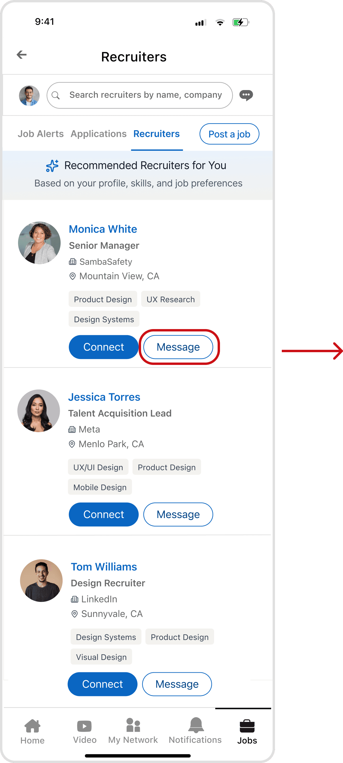
Recruiter Tab
Recruiter Tab
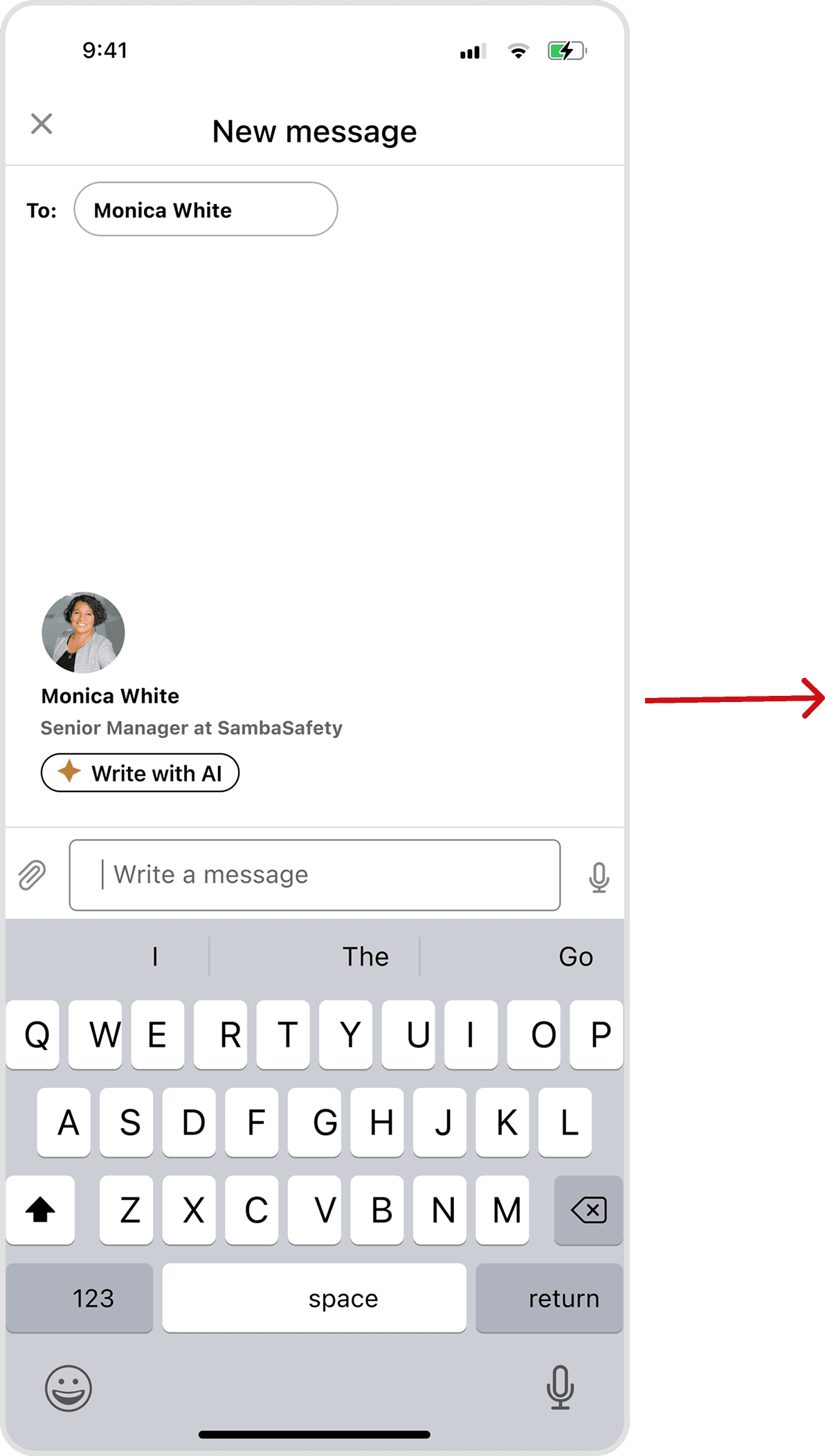
LinkedIn’s current model restricts recruiter contact to specific job posts and often requires a Premium subscription, creating a paywall for basic networking. Furthermore, the lack of a dedicated hub for application-related chats forces users to sift through a cluttered general inbox, making follow-ups a disorganized hassle.
The redesigned version eliminates this friction with a direct "Message" option and a streamlined communication history. By centralizing these interactions, the platform becomes more transparent and accessible, allowing job seekers to stay organized and take a proactive approach to their search.
New Design
After
Recruiter Tab
LinkedIn’s current model restricts recruiter contact to specific job posts and often requires a Premium subscription, creating a paywall for basic networking. Furthermore, the lack of a dedicated hub for application-related chats forces users to sift through a cluttered general inbox, making follow-ups a disorganized hassle.
The redesigned version eliminates this friction with a direct "Message" option and a streamlined communication history. By centralizing these interactions, the platform becomes more transparent and accessible, allowing job seekers to stay organized and take a proactive approach to their search.
New Design
New Design
After
After
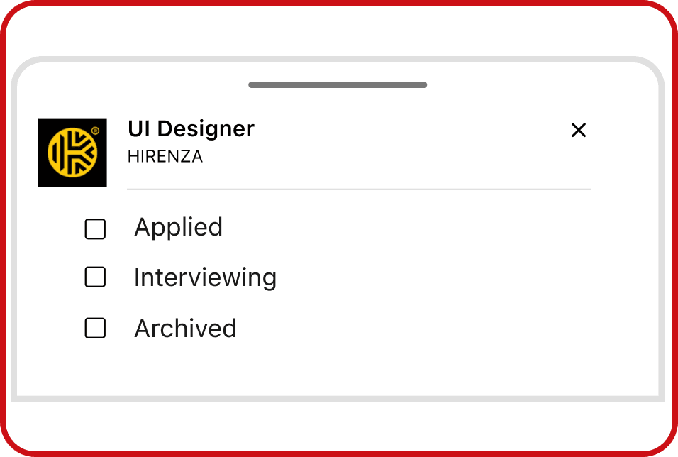
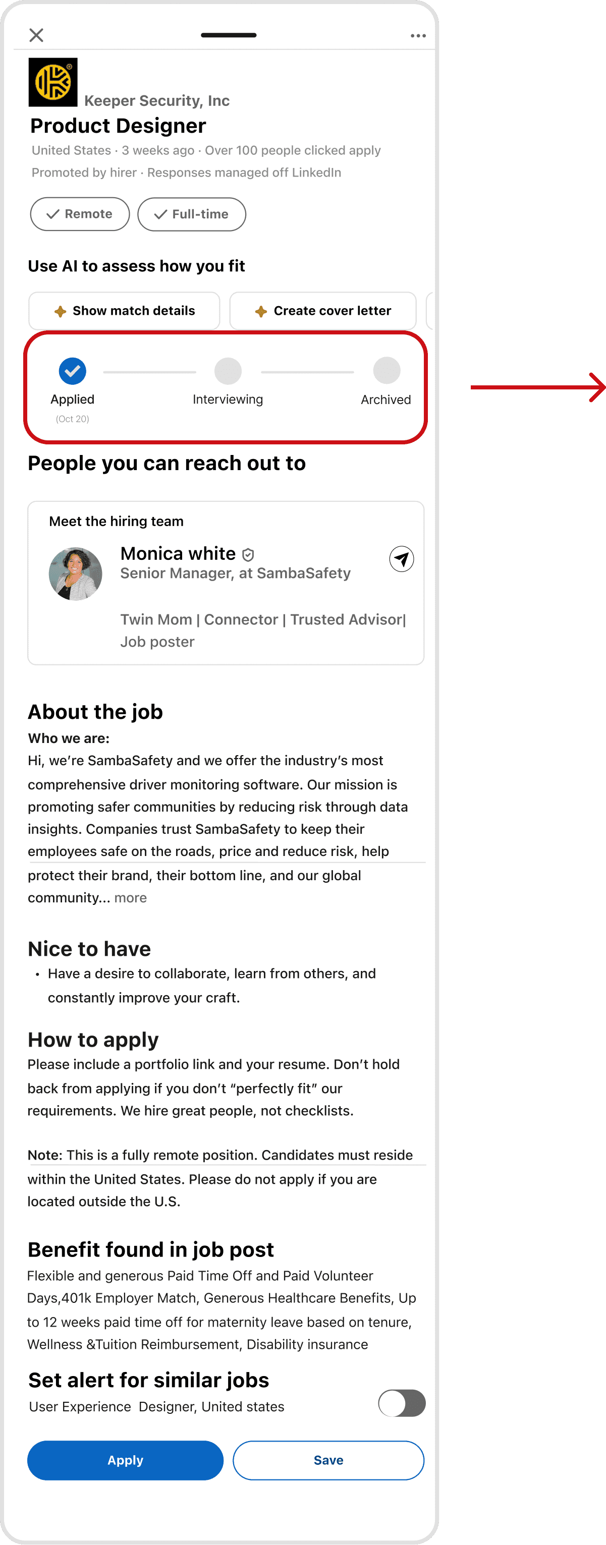
A core goal of our redesign was to move away from LinkedIn’s confusing layout and create a centralized job dashboard. To do this, we added a status progress bar that shows exactly where you are in the hiring process.
In the old version, users had to click through different tabs just to guess their status. Now, you can instantly see if a job is Applied, Interviewing, or Archived right on the job page. This progress bar updates automatically, clearing up the uncertainty of job hunting and giving you a simple, all-in-one place to track your entire search.
Application Tracking Bar
Application Tracking Bar
A core goal of our redesign was to move away from LinkedIn’s confusing layout and create a centralized job dashboard. To do this, we added a status progress bar that shows exactly where you are in the hiring process.
In the old version, users had to click through different tabs just to guess their status. Now, you can instantly see if a job is Applied, Interviewing, or Archived right on the job page. This progress bar updates automatically, clearing up the uncertainty of job hunting and giving you a simple, all-in-one place to track your entire search.
New Design
After
Application Tracking Bar
After
A short walkthrough of the redesigned application flow from job discovery, through application tracking, to recruiter contact.
A short walkthrough of the redesigned application flow from job discovery, through application tracking, to recruiter contact.
After
Redesign in Motion
A short walkthrough of the redesigned application flow from job discovery, through application tracking, to recruiter contact.
Prototype
the validation
the validation
Usability Testing
Usability Testing
8 out of 8 testers rated the redesign 7+ out of 10 for control over their job search, averaging 8.9.
8 out of 8 testers rated the redesign 7+ out of 10 for control over their job search, averaging 8.9.
8 out of 8 testers rated the redesign 7+ out of 10 for control over their job search, averaging 8.9.
To test drive the redesign, we ran an unmoderated usability study in Maze on the interactive prototype with 8 participants. Each completed five core tasks, updating an off-platform (LinkedIn) application's status, filtering a job search, messaging a recruiter, managing resume versions, and reviewing a job alongside its recruiter and pipeline stage while Maze recorded success, mis-clicks, time on task, and a closing confidence rating.
By combining insights from user interviews and surveys, we prioritized solutions based on user impact and development effort. Impact was measured by how well features addressed eroding trust, lack of transparency, and the “application black hole.” Effort was assessed by technical complexity, from AI-driven scam detection to simpler UI improvements. This approach helped identify quick wins that deliver immediate value without major engineering changes.
Message a recruiter
Message a recruiter
Message a recruiter
%100
%100
Fastest task at 9.6s with the lowest mis-click rate (12.5%). Direct recruiter contact worked cleanly.
Fastest task at 9.6s with the lowest mis-click rate (12.5%). Direct recruiter contact worked cleanly.
Fastest task at 9.6s with the lowest mis-click rate (12.5%). Direct recruiter contact worked cleanly.
Review job + recruiter + pipeline
Review job + recruiter + pipeline
Review job + recruiter + pipeline
%100
%100
All 7 testers completed this multi-step flow, mostly via exploratory paths. The information was findable through couple of steps.
All 7 testers completed this multi-step flow, mostly via exploratory paths. The information was findable through couple of steps.
All 7 testers completed this multi-step flow, mostly via exploratory paths. The information was findable through couple of steps.
Manage resume versions
Manage resume versions
Manage resume versions
%88
%88
Most found the dedicated resume space; one didn't, flagging discoverability as the next thing to tighten.
Most found the dedicated resume space; one didn't, flagging discoverability as the next thing to tighten.
Most found the dedicated resume space; one didn't, flagging discoverability as the next thing to tighten.
Task Name
Task Name
Task Name
Task Stat
Task Stat
Task Stat
Task Insight
Task Insight
Task Insight
Update application status
Update application status
Update application status
%100
%100
Every tester logged an off-platform application for the core tracking gap, though a high misclick rate shows the entry point can be clearer.
Every tester logged an off-platform application for the core tracking gap, though a high misclick rate shows the entry point can be clearer.
Every tester logged an off-platform application for the core tracking gap, though a high misclick rate shows the entry point can be clearer.
Filter a job search
Filter a job search
Filter a job search
%75
%75
A known artifact: the prototype ran flawlessly in Figma and in-browser but destabilized inside Maze's embedded player, resetting steps and inflating drop-offs. Setting that aside, the misclick rate still flags filter affordances that need to read as more clearly tappable and my top redesign priority.
A known artifact: the prototype ran flawlessly in Figma and in-browser but destabilized inside Maze's embedded player, resetting steps and inflating drop-offs. Setting that aside, the misclick rate still flags filter affordances that need to read as more clearly tappable and my top redesign priority.
A known artifact: the prototype ran flawlessly in Figma and in-browser but destabilized inside Maze's embedded player, resetting steps and inflating drop-offs. Setting that aside, the misclick rate still flags filter affordances that need to read as more clearly tappable and my top redesign priority.
Severity tag
Severity tag
Severity tag
Findings
Findings
Findings
Validated
Validated
Validated
The redesign delivered on its core promise: testers rated their sense of control 8.9/10, and 100% completed the manual status-update task that LinkedIn can't currently support.
The redesign delivered on its core promise: testers rated their sense of control 8.9/10, and 100% completed the manual status-update task that LinkedIn can't currently support.
The redesign delivered on its core promise: testers rated their sense of control 8.9/10, and 100% completed the manual status-update task that LinkedIn can't currently support.
Major
Major
Major
Filtering was the weak point (75% success, 81% misclicks), but partly an instrument artifact: the prototype was stable everywhere except Maze's player. The genuine signal underneath is that filter controls need stronger tappable affordances, the fix we'd prioritize.
Filtering was the weak point (75% success, 81% misclicks), but partly an instrument artifact: the prototype was stable everywhere except Maze's player. The genuine signal underneath is that filter controls need stronger tappable affordances, the fix we'd prioritize.
Filtering was the weak point (75% success, 81% misclicks), but partly an instrument artifact: the prototype was stable everywhere except Maze's player. The genuine signal underneath is that filter controls need stronger tappable affordances, the fix we'd prioritize.
Minor
Minor
Minor
Resume management and the status-update entry point both worked but carried elevated misclicks, pointing to labeling and discoverability fixes rather than structural ones.
Resume management and the status-update entry point both worked but carried elevated misclicks, pointing to labeling and discoverability fixes rather than structural ones.
Resume management and the status-update entry point both worked but carried elevated misclicks, pointing to labeling and discoverability fixes rather than structural ones.
A limitation: the prototype performed reliably in Figma and in-browser but degraded inside Maze's embedded environment, occasionally resetting a step mid-task, which inflated drop-offs, most visibly on filtering. We'd run the next round in a more stable test setup and screen for active LinkedIn job-seekers, since a warm-up signal showed several testers don't regularly apply through LinkedIn.
A limitation: the prototype performed reliably in Figma and in-browser but degraded inside Maze's embedded environment, occasionally resetting a step mid-task, which inflated drop-offs, most visibly on filtering. We'd run the next round in a more stable test setup and screen for active LinkedIn job-seekers, since a warm-up signal showed several testers don't regularly apply through LinkedIn.
Reflection
Reflection
The hardest interaction taught the most
The hardest interaction taught the most
The hardest interaction taught the most
The filter system inside the search bar was the hardest, most rewarding part of this redesign — building filters directly into the search flow so someone can narrow by role, location, salary, and work type without losing their place. It's the work I'm proudest of, and it took the most iteration of anything in the project.
Testing also taught me to separate tool noise from real signal: the prototype ran cleanly in Figma and in-browser but destabilized inside Maze's embedded player, inflating the friction on the filter task. With more time, I'd sharpen the filter affordances and re-run validation in a more stable setup — the redesign hit its core goal (testers rated their sense of control 8.9/10), and the filter system is the work I'd build on first.
By combining insights from user interviews and surveys, we prioritized solutions based on user impact and development effort. Impact was measured by how well features addressed eroding trust, lack of transparency, and the “application black hole.” Effort was assessed by technical complexity, from AI-driven scam detection to simpler UI improvements. This approach helped identify quick wins that deliver immediate value without major engineering changes.