Brigitte
Brigitte
BRIGITTE
Designing a Plant-Based Skincare Store from Brand to Checkout
Designing a Plant-Based Skincare Store from Brand to Checkout
Designing a Plant-Based Skincare Store from Brand to Checkout

Brigitte is a plant-based skincare line built on organic ingredients, environmentally friendly products, and cruelty-free practice. The line covers a full skin-type spectrum, from sensitive to dry, oily to combination. I designed the complete e-commerce experience: the brand identity, the UI system, the responsive store, and a tested prototype for both desktop and mobile.
Brigitte is a plant-based skincare line built on organic ingredients, environmentally friendly products, and cruelty-free practice. The line covers a full skin-type spectrum, from sensitive to dry, oily to combination. I designed the complete e-commerce experience: the brand identity, the UI system, the responsive store, and a tested prototype for both desktop and mobile.
Brigitte is a plant-based skincare line built on organic ingredients, environmentally friendly products, and cruelty-free practice. The line covers a full skin-type spectrum, from sensitive to dry, oily to combination. I designed the complete e-commerce experience: the brand identity, the UI system, the responsive store, and a tested prototype for both desktop and mobile.

My Role
UX - UI Designer
Duration
6 Weeks
Tools
Figma, FigJam, Maze, Miro, Trello,
Adobe Illustrator, Photoshop
My Role
UX - UI Designer
Duration
6 Weeks
Tools
Figma, FigJam, Maze, Miro, Trello, Adobe Illustrator, Photoshop
My Role
UX - UI Designer
Duration
6 Weeks
Tools
Figma, FigJam, Maze, Miro, Trello,
Adobe Illustrator, Photoshop

What is the core problem?
What is the core problem?
People who care about clean skincare struggle to find products they can trust. In my research, one third of people could not find products on the market suited to their skin type. Most sites make shoppers dig for the ingredient and skin-type information they actually decide on. The purchase stalls on missing information, not on price.
People who care about clean skincare struggle to find products they can trust. In my research, one third of people could not find products on the market suited to their skin type. Most sites make shoppers dig for the ingredient and skin-type information they actually decide on. The purchase stalls on missing information, not on price.
Research and Survey
Research and Survey
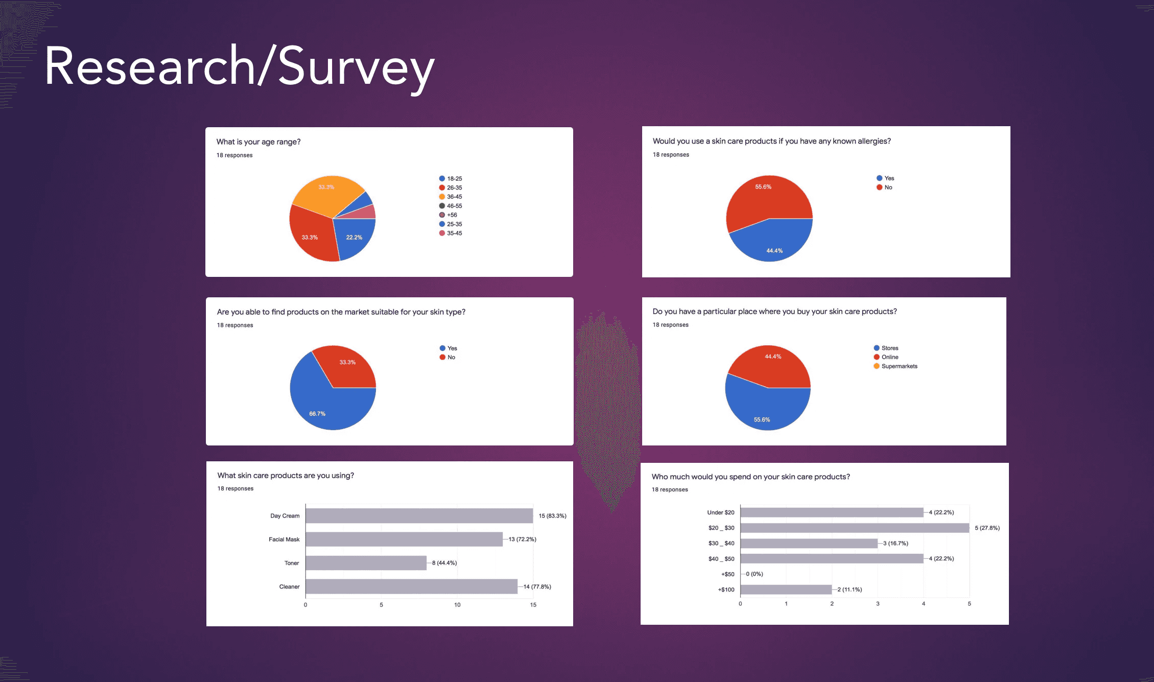
I surveyed 18 people about how they buy skincare. The findings shaped every later decision:
One in three could not find products suited to their skin type.
More than half check for allergies and ingredients before buying.
Shoppers split between stores and online, so the experience had to work on any screen.
Cleanser, day cream, and facial masks were the most-used products, so those needed to surface first.
I surveyed 18 people about how they buy skincare. The findings shaped every later decision:
One in three could not find products suited to their skin type.
More than half check for allergies and ingredients before buying.
Shoppers split between stores and online, so the experience had to work on any screen.
Cleanser, day cream, and facial masks were the most-used products, so those needed to surface first.
Competitive Analysis
Competitive Analysis
I studied La Mer, Clinique, Guerlain, and Olay. The prestige sites looked polished but buried ingredient and skin-type detail behind dense menus. That gap set Brigitte's direction: put the information people decide on up front, and let them filter by skin type, concern, and ingredient.
I studied La Mer, Clinique, Guerlain, and Olay. The prestige sites looked polished but buried ingredient and skin-type detail behind dense menus. That gap set Brigitte's direction: put the information people decide on up front, and let them filter by skin type, concern, and ingredient.

Who Are We Designing For?
Who Are We Designing For?
Busy professional female: Sara Smith, flight attendant
Busy professional female: Sara Smith, flight attendant
Busy professional female: Sara Smith, flight attendant
Sara is a busy flight attendant with sensitive skin and an environmental conscience. She wants cruelty-free, organic products with recyclable packaging at a fair price. Her core frustration is that brands do not disclose their full ingredients, so she cannot tell what is safe for her skin. Sara set the priorities for the whole store: ingredient transparency, clear skin-type guidance, and trust.
Sara is a busy flight attendant with sensitive skin and an environmental conscience. She wants cruelty-free, organic products with recyclable packaging at a fair price. Her core frustration is that brands do not disclose their full ingredients, so she cannot tell what is safe for her skin. Sara set the priorities for the whole store: ingredient transparency, clear skin-type guidance, and trust.

Brand and UI Kit
Brand and UI Kit
How the visuals been picked?
How the visuals been picked?
How the visuals been picked?
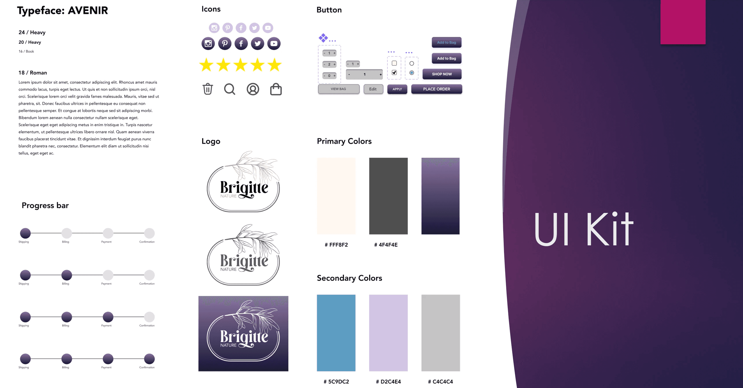
I built the brand and interface system from the ground up. The typeface is Avenir. The palette pairs a soft off-white (#FFF8F2) and charcoal (#4F4F4E) with a deep purple gradient, plus blue, lavender, and grey accents. I designed the logo, the icon set, the product cards, the buttons, and a four-step checkout progress bar, so the store stays consistent across every page and screen.
I built the brand and interface system from the ground up. The typeface is Avenir. The palette pairs a soft off-white (#FFF8F2) and charcoal (#4F4F4E) with a deep purple gradient, plus blue, lavender, and grey accents. I designed the logo, the icon set, the product cards, the buttons, and a four-step checkout progress bar, so the store stays consistent across every page and screen.

the design
Results
Results
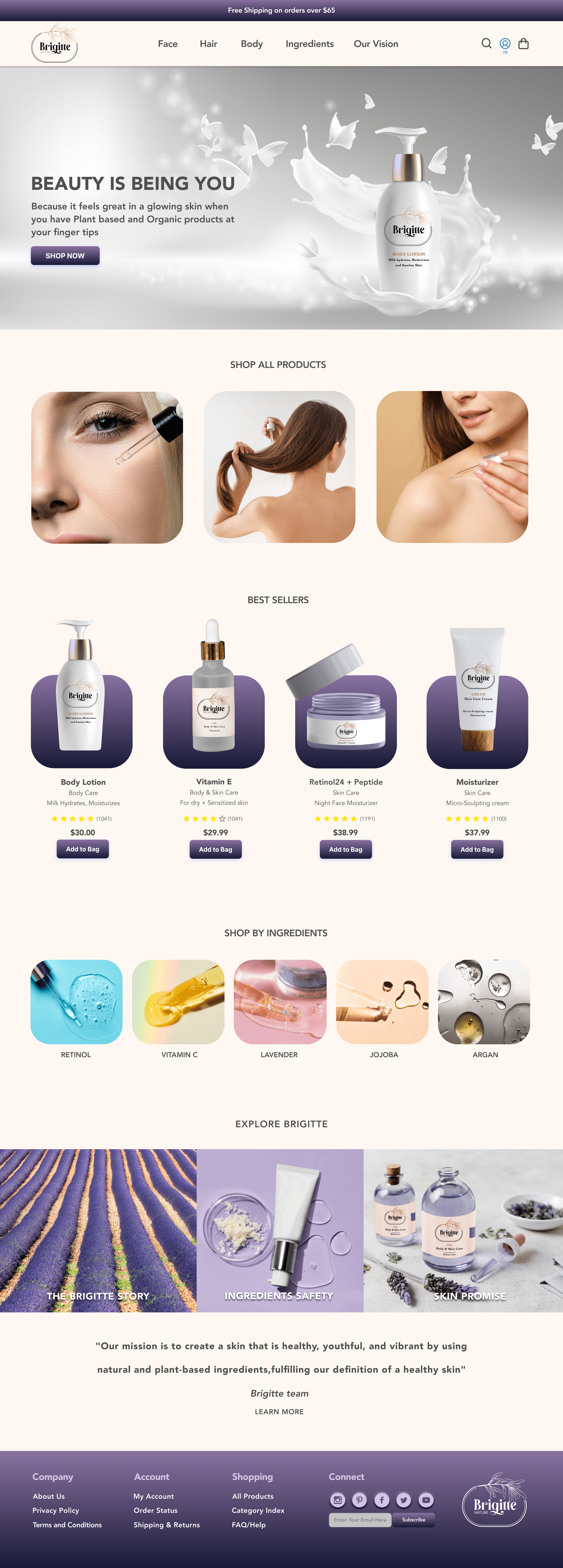
I designed a responsive store for desktop and mobile. The homepage leads with the brand promise and a clear path to shop. Products are organized by Face, Hair, Body, and Ingredients, so shoppers filter the way they actually think. Product pages place Reviews, Ingredients, and Skin Routine in tabs, exactly where Sara looks first. The four-step checkout (Shipping, Billing, Payment, Confirmation) keeps progress visible the whole way through, ending in a clear order confirmation.
I designed a responsive store for desktop and mobile. The homepage leads with the brand promise and a clear path to shop. Products are organized by Face, Hair, Body, and Ingredients, so shoppers filter the way they actually think. Product pages place Reviews, Ingredients, and Skin Routine in tabs, exactly where Sara looks first. The four-step checkout (Shipping, Billing, Payment, Confirmation) keeps progress visible the whole way through, ending in a clear order confirmation.
Home page
Desktop & Mobile
Home page
Desktop & Mobile

Home page
Desktop & Mobile
Desktop
Desktop
Mobile
Mobile

Home page
Home page
Desktop
Mobile
Home page
Desktop
Desktop

Mobile
Mobile

Product page
Product page
Desktop
Mobile
Product page
Desktop
Desktop

Mobile
Mobile

Product detail page
Product detail page
Desktop
Mobile
Product detail page


Login page
Login page


Login page
New Design
New Design

After
After
Shopping cart
Shopping cart
New Design
After
Shopping cart
Redesign in Motion
After
Payment & Confirmation of purchase pages
Payment & Confirmation of purchase pages
Payment & Confirmation of purchase pages


Prototypes
Prototypes
Prototypes
the validation
Testing and Iteration
Testing and Iteration
A/B Testing - Usability Testing
A/B Testing - Usability Testing
A/B Testing - Usability Testing
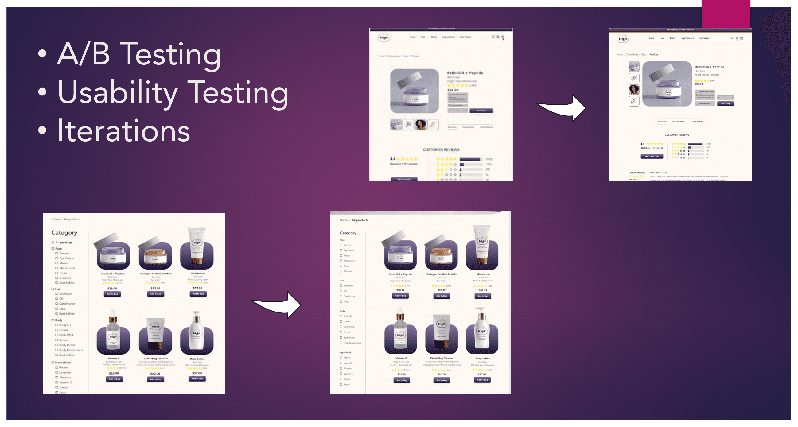
I ran A/B testing and usability testing, then iterated. The clearest improvement came from the category page. The first version listed filters as a long column of checkboxes, and testers missed them. I restructured the filters into grouped, scannable categories by Face, Hair, Body, and Ingredients. The product page tabs were refined the same way, based on what testers actually clicked.
I ran A/B testing and usability testing, then iterated. The clearest improvement came from the category page. The first version listed filters as a long column of checkboxes, and testers missed them. I restructured the filters into grouped, scannable categories by Face, Hair, Body, and Ingredients. The product page tabs were refined the same way, based on what testers actually clicked.
Reflection
Reflection
Communication and clarity is a must
Communication and clarity is a must
Communication and clarity is a must
The result is a complete, tested e-commerce experience: a consistent visual system, responsive desktop and mobile layouts, and a checkout flow built around what shoppers told me they needed, which is transparency, skin-type clarity, and trust.
The result is a complete, tested e-commerce experience: a consistent visual system, responsive desktop and mobile layouts, and a checkout flow built around what shoppers told me they needed, which is transparency, skin-type clarity, and trust.